HOW WE HAVE CHANGED THE LOOK OF OUR MENU
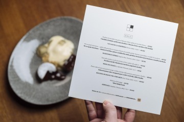
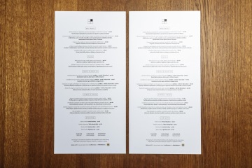
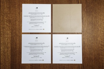
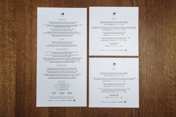
Frequent guests of La Finestra have noticed that along with the redecoration in July, we have also changed the look of our wine list, à la carte, and dessert menus. Today we would like to tell you why, and show you how a well thought-out menu can contribute to the dining experience.
We wanted the redesigned menu to match the new modern and sophisticated interior at La Finestra to create a unified visual identity. This effort was led by the very talented Soňa Valentová, the graphic designer at Ginger and Fred.
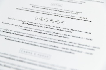
Like the new interior, the new menu uses earthy colors. A redesign of the layout and a rearranging of the menu sections has contributed to the minimalist look, and the section names are now placed in windows on the page (La Finestra means “The Window” in Italian). And when the menu, dessert card and group offer are placed together on the table, they form one large image of the restaurant’s window logo.
"The new visual identity for the La Finestra menu took me about two months to develop. I was guided by the restaurant’s new interior design and by the logo and brand characteristics. Sophisticated elegance and simplicity combined with superior quality. These elements from the restaurant inspired the precise design and composition of the menu."
These changes have also affected the wine list, but we will tell you more about this soon.
